Blend Photo Editor & Effect
- 4.7
- Rating
- 10.00M
- Installs
- Free
- Price
 Analysis by App-foxy
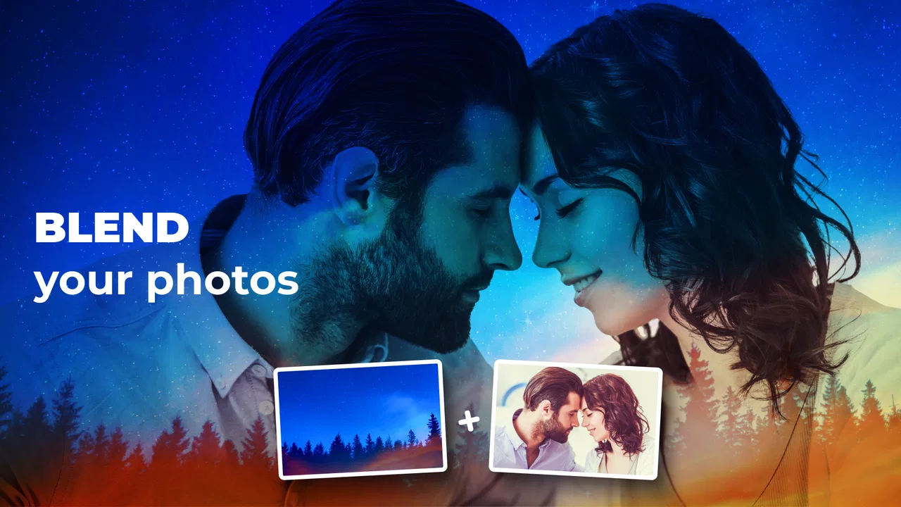
I usually approach photo-blending apps with a little caution. They can look simple in the store, yet the real test is what happens when I try to turn two ordinary pictures into something worth sharing. Blend Photo Editor & Effect from ZipoApps is aimed at that exact moment: combining images into a single visual with an artistic feel, without asking me to learn a full desktop editor first.
After spending time with it, I see it as a focused photo blending app rather than a complete replacement for a serious image editor. Its appeal is immediate experimentation. I can take a portrait, a texture, a landscape, or a second photograph and explore how they interact. The results depend heavily on the source images and on how patiently I adjust the composition, but the basic idea is accessible enough for casual creators.
The app is free to install and is listed for Everyone, which makes it easy to recommend for family-friendly creative projects. It belongs to the Art & Design category, has reached over five million installs, and holds a 4.7 average from around thirty-four thousand ratings. Those figures suggest that its straightforward concept has found a broad audience, although popularity does not remove the need to understand its limitations.
You May Also Like

 Pandora - Music & Podcasts
Pandora’s Music Is Easy to Start, but Harder to Recover
Pandora’s strength is its low-effort path from a seed to a station. Its weak spot is how much confidence it asks you to place in connection, setup, and quiet recovery.

 8 Ball Pool
 Is Built on Rivalries, Rematches, and Routine
A close look at the rivalries, rematches, shared routines, and unanswered safety questions that turn a quick pool match into a persistent mobile community.

 Samsung Music
’s Quiet Strength Is Playing What You Already Own
Its reach comes less from spectacle than from dependable access to a personal library. That simplicity is both the app’s strongest retention engine and its ceiling.

 AccuWeather: Weather Radar
AccuWeather Review: A Quick, Clear Forecast for Everyday Decisions
For everyday plans, the best forecast is the one you can understand quickly. AccuWeather makes rain timing, radar, and local conditions easy to act on, with a few trade-offs.

 Hill Climb Racing
Why Hill Climb Racing Still Turns Crashes Into One More Run
A tiny car, a bumpy hill and one more upgrade: Hill Climb Racing keeps resurfacing because its simple chaos makes every near-miss feel personal.

 AliExpress - Shopping App
AliExpress Makes Global Shopping Feel Personal, but Shoppers Bear the Risk
AliExpress turns a global marketplace into a pocket-sized discovery engine. Its reach is useful, its shopping loop compelling, and its trade-offs easy to miss.
More From Our News Desk
View All News

Where the experience can become confusing
I find the first confusing moment usually comes after the initial blend: the preview may look striking, but it is not always clear which source image is responsible for the imbalance. In this section, I focus on reading the composition before changing anything, so the next heading can move from diagnosis to a few checks that make the editing session easier to manage.
The first blend is easy; controlling the result takes practice
The most common point of friction is not opening the editor. It is understanding why a blend looks muddy, too bright, or visually unbalanced. Two attractive photos do not automatically make an attractive composite. A detailed background can overpower a portrait, while two dark images may lose their subjects when merged.
I get better results when I choose one image as the clear subject and treat the other as atmosphere. For example, a person standing against a plain wall works more reliably with clouds, leaves, city lights, or a soft texture than with another busy group photograph. This is a useful distinction because the app encourages creative combinations, but it cannot decide which visual elements should remain dominant in every situation.
Another sticking point is expecting the first preview to look finished. Blending is more successful when I pause to inspect edges, bright areas, and faces instead of accepting the first appealing thumbnail. A face placed over a high-contrast texture may look imaginative at a glance but distracting when viewed at full size.
Image choice matters more than dramatic effects
I found that source preparation has a bigger effect than adding more visual treatment. A sharply lit subject combined with a low-contrast background often creates a stronger result than two highly edited images. If the photos have different color moods, the blend can feel accidental. Choosing images with related tones before importing them saves time later.
This is also where the app differs from a traditional collage maker. A collage usually keeps each image in its own visible area, so mismatched lighting is less damaging. Here, the pictures are meant to occupy the same visual space. The reward is a more seamless, dreamlike image, but the trade-off is that poor source selection becomes obvious much faster.
Do not confuse a blend with a precise layer edit
People who are used to advanced desktop software may look for detailed masking, exact selections, or finely controlled layer behavior. That is not the reason I would choose this app. Its strength is the quick visual experiment, not pixel-level production work. If I need a product image with a perfectly clean outline, a technical diagram, or a carefully isolated object, a dedicated editor is the better tool.
That limitation is not necessarily a flaw. A focused app can be more comfortable when I want a creative result in a few minutes. The important thing is to choose it for expressive overlays and double-exposure-style ideas, not for demanding retouching or professional compositing.
Setup checks that prevent avoidable frustration
Before starting, I like to decide what the finished image needs to communicate and choose source photos with that purpose in mind. That small bit of planning can prevent wasted adjustments, but it also helps distinguish a setup issue from an artistic choice; the following section turns those checks into a practical starting routine.
Start with a manageable pair of photos
Before blaming the editor, I check the images themselves. I prefer one clear subject and one supporting image, with enough visual space around the subject. A portrait with a simple outline is easier to blend than a crowded photograph containing several people, signs, and bright objects.
I also avoid beginning with two very large, highly detailed images when I am only testing the workflow. Starting with simpler pictures makes it easier to judge the controls and understand what changed. Once I know how the composition behaves, I can move to more ambitious combinations.
A practical trick is to prepare a small test set in the device’s photo library: one portrait, one texture, one outdoor scene, and one image with strong light and shadow. This gives me repeatable material for comparing results. It is more useful than changing both source images and the editing approach at the same time.
Check the basic phone conditions first
The application supports devices running Android 5.0 or later, and the current version is 4.5.9. If the app opens but behaves strangely, I first check whether the device software meets that baseline and whether the application is updated through the normal store process. I also close other demanding apps before trying again, especially when working with detailed photographs.
These are simple checks, but they separate an editing problem from a device problem. If a preview is slow only when several other apps are active, changing the source image may not solve anything. A clean restart of the app can be more sensible than repeatedly tapping the same control.
Allow the photo workflow to complete
When I select an image, I give the preview a moment to appear before making another choice. Rapidly switching between pictures while the editor is still processing can make it seem as though the wrong image was selected. My habit is to select one photo, wait for the canvas to settle, and then move on to the next adjustment.
I also keep the original photographs untouched. I work from copies or from images that are already safely stored in my library, then compare the finished blend with the originals. This is good practice for any creative app and makes it easier to retry a composition without feeling that an earlier experiment has damaged the source.
Understand the free model before committing to a project
The app is free, but it includes in-app purchases ranging from $0.99 to $99.99 per item. That range is worth noticing before I begin a large project or hand the phone to a child. I would explore the free experience first, then review any purchase prompt carefully rather than assuming every part of the workflow is included without charge.
For occasional personal images, the free starting point may be enough to decide whether the style suits me. For frequent use, I would consider the purchase screen as part of the decision, not as an interruption to ignore. The right value depends on how often I blend photos and whether I need whatever additional options are offered at the moment of use.
Recovering a workflow when the result goes wrong
When a blend disappoints me, I try to change one thing at a time rather than rebuilding the entire idea without knowing what went wrong. I compare the source images, simplify the composition, and then test again, which makes recovery more deliberate and helps identify whether the problem lies in the pairing or in the workflow.
When the blend looks dull or muddy
I recover from a muddy result by simplifying rather than adding more. I return to the source pair and ask which image should carry the subject. If both photographs contain strong detail, I replace one with a quieter image. This often produces a bigger improvement than repeatedly changing the same effect.
Brightness is another useful clue. Two dark images may merge into a gray mass, while two bright images can wash out important details. I try a light subject with a darker supporting image, or the reverse, depending on whether I want the result to feel airy or dramatic. The goal is contrast with cooperation, not contrast everywhere.
When a face or important object disappears
For portraits, I keep the face away from the busiest part of the second image. Texture, branches, lettering, and sharp architectural lines can cross the eyes or mouth and make the result feel messy. Moving the visual emphasis toward clothing, hair, or the surrounding silhouette usually creates a more intentional effect.
If the subject still disappears, I do not assume the app is failing. The two photos may simply have competing focal points. I test the portrait with a softer background or with a composition where the subject occupies more of the frame. This is one of the most useful lessons from using a blender: placement and source quality often matter more than the number of available treatments.
When a saved image is not what I expected
I check the preview carefully before saving, including the corners and the edges of the main subject. A composition can look balanced in the center but reveal distracting overlaps near the border. I also compare the saved image with the on-screen preview rather than judging from a small thumbnail in the gallery.
If something looks wrong, I recreate the blend from the original photos instead of repeatedly editing an already blended result. Each extra generation can make details harder to judge. Keeping a clean source pair gives me a reliable recovery point and makes experimentation much less frustrating.
A useful workflow for social posts and personal projects
For a quick social image, I use a three-stage routine. First, I choose a recognizable subject. Second, I pair it with a background that supports the mood without competing for attention. Third, I inspect the result at a larger size and remove the blend if it hides the message I want the image to communicate.
For a personal project, I save several variations instead of trying to find one perfect result immediately. A subtle blend may work better as a profile image, while a stronger overlay may suit a poster-like graphic. The app is particularly useful here because it encourages comparison, but I still make the final choice based on readability rather than novelty.
When the app is not the cause
A disappointing result does not automatically mean the editor has malfunctioned. I look at the original image quality, lighting, and whether the files behave normally in the photo library before drawing that conclusion; the next section considers those outside factors and when a different tool may be the sensible choice.
Problems caused by the original photographs
Some disappointing results come from incompatible lighting. A warm indoor portrait placed over a cool blue landscape can look disconnected even when the blend itself is functioning correctly. The same applies to perspective: a close-up face and a distant horizon may require a deliberate artistic concept to feel convincing.
Resolution can also affect expectations. A small or heavily compressed source image cannot suddenly become a crisp, detailed composite. I prefer to start with clear originals, especially when the final image will be viewed on a larger screen. If the source already contains blur, noise, or compression marks, blending may make those flaws more visible.
Problems caused by the phone or photo library
If an image does not appear as expected, I check whether it is actually available in the device’s normal photo library and whether another app can open it. This helps identify a library or file issue rather than an editing issue. I avoid drawing conclusions from one unusual file when ordinary photographs work normally.
When the interface feels unresponsive, I close the app, reopen it, and retry with a simpler image pair. If the simpler test works, the original files or the device’s current workload may be involved. If the same problem continues across basic tests, I would use the application’s normal support route rather than repeatedly reinstalling without a clear reason.
When another app is the better choice
I would skip this editor if my priority is precise object removal, advanced color correction, typography, or a carefully controlled commercial composite. A full photo editor offers more control for those jobs, even though it may take longer to learn. A conventional collage tool is also better when I want several complete photos displayed side by side with clean borders.
I would also choose something else if I dislike experimenting. The best results here come from trying different source pairs and judging subtle changes. Someone who wants a fixed template, a one-tap portrait correction, or a purely organizational photo tool may find the blending concept unnecessary.
Practical verdict after using it
My strongest recommendation is to treat Blend Photo Editor & Effect as a creative sketchbook, not a professional finishing suite. It gives me a quick way to combine photographs and explore visual ideas without the heavier process associated with advanced editors. That makes it useful for social graphics, mood images, personal experiments, and simple art projects.
The developer, ZipoApps, has kept the central idea easy to understand: bring images together and see what happens. The app’s store summary describes it as an ultimate photo blender for turning pictures into creative artwork, but my practical interpretation is more grounded. It works best when I supply the creative direction through careful image selection, sensible contrast, and restraint.
Its free availability lowers the barrier to trying it, while the Everyone age rating makes it approachable for a broad audience. At the same time, the in-app purchase range means I would inspect any upgrade prompt before assuming that longer-term use will remain entirely free. That is especially important if several people share one device.
The app has been available since September 1, 2019, and its current version is 4.5.9. For someone deciding whether to install it today, the more important question is not how long it has existed but whether photo blending matches the intended job. If the answer is yes, the focused workflow is appealing. If the goal is complete image control, the simplicity will feel restrictive.
My everyday example would be creating a birthday post from a favorite portrait and a background connected to the person’s interests: a travel scene, a soft paper texture, or a night skyline. I would test several combinations, keep the face clear, and choose the version that still reads well when viewed quickly. That process captures the app’s real value: it helps turn ordinary pictures into visual ideas, provided I do some of the artistic thinking myself.
Overall, I would recommend it to beginners, casual creators, and anyone curious about layered photo effects. I would not recommend relying on it alone for exact commercial work or detailed retouching. Its best quality is immediacy, and its main weakness is the same thing: a fast blending tool cannot replace deliberate source preparation and fine control. Used within those boundaries, it is an enjoyable and practical addition to an Android photo toolkit.
FAQs for Blend Photo Editor & Effect
01What features does Blend Photo Editor & Effect offer?
Blend Photo Editor & Effect provides a variety of tools for enhancing and combining photos. Users can access filters, overlays, and blending modes to create stunning images. The app also includes basic editing tools like crop, rotate, and adjust brightness and contrast, making it suitable for both beginners and advanced users.
02Is Blend Photo Editor & Effect user-friendly for beginners?
Yes, Blend Photo Editor & Effect is designed with an intuitive interface that is easy to navigate, making it accessible for beginners. The app offers tutorials and tips to help users understand how to use its features effectively. Its user-friendly design ensures a smooth editing experience even for those new to photo editing.
03Does Blend Photo Editor & Effect support high-resolution exports?
Blend Photo Editor & Effect supports high-resolution exports, allowing users to maintain the quality of their images. This feature is particularly useful for professional photographers or designers who need to print their work or use it on other platforms without losing detail or clarity.
04Are there in-app purchases or subscriptions in Blend Photo Editor & Effect?
While Blend Photo Editor & Effect is free to download, it offers in-app purchases and a subscription model. These provide access to premium features, additional filters, and advanced tools. Users can choose to purchase individual features or opt for a subscription for unlimited access, depending on their needs.
05Is Blend Photo Editor & Effect available for both Android and iOS?
Yes, Blend Photo Editor & Effect is available for download on both Android and iOS platforms. This ensures a wide range of users can access its features, regardless of their device type. The app is optimized for both operating systems, providing a seamless experience on smartphones and tablets.
Pros
- User-friendly interface for quick edits.
- Wide variety of blending effects available.
- High-quality output with minimal effort.
- Regular updates with new features.
- Compatible with most device resolutions.
Cons
- Contains intrusive ads during usage.
- Limited free features without subscription.
- Occasional crashes on some devices.
- Requires internet for full functionality.
- Editing tools lack advanced options.

Blend Photo Editor & Effect
Gallery